Build In Public Journal #4
A post about my logo design process and building UI features while traveling ✈️
Hello friend,
The purpose of these posts, besides sharing the process of building TechTerms, is to keep me accountable in a way and to work in a more organized manner. I tend to randomly work on what needs to be done without having a proper planning. Because I'm writing these newsletters, I have to write something that makes sense, so I have to pick my tasks and topics the same way.
One more disclaimer before going on: if you follow me on social media or you've starred the Github repository, you might have noticed that my posts are a bit behind compared to the actual development. The reason for that is I'm trying to write about everything I do that's worth mentioning. This means I have a lot of content. In order to keep the newsletters somewhat short, I had to split them across multiple weeks. So let's get it started!
Designing the logo
We now have an idea, and we also have a rough version of the app working.
(Recap: I'm building techterms.io - an open source glossary app that contains difficult tech terms. The purpose of the app is to help newcomers to tech and tech enthusiasts understand the most common tech terms and concepts.)
The first idea is to use a simple academic cap. I found some SVGs I could use, but there's nothing tech-related there. The other option would be to use a closed book and show a tech symbol on its cover.
Usually when I design a logo, I start with an idea, explore for a while, try different SVGs and colors until I end up with a result that's reasonably good.
Before diving deeply into the process, here are a few important things to keep in mind:
I'm not an expert designer by any means. I've developed some skills over the years by designing logos for side projects, but I'm not a genuine logo or branding designer. I believe you can develop a sense of taste and build workflows to make the design process easier and create something decent, but I cannot compare my own work with a real designer's portfolio.
As I said previously, I'm sharing my process of designing. It might look a bit hectic (and I believe it is). If want to learn logo design, maybe you should try finding some experts or courses in the field.
I believe the logo is not the most important aspect when it comes to building a product. A great design can definitely help. A well-done branding can be easily recognized by users. But if the product is bad, it doesn't matter if the branding is good.
Tried to find some inspiration in Canva
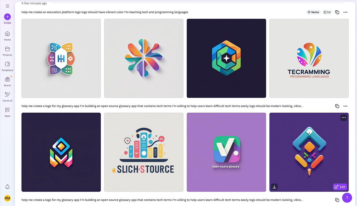
I tried to generate a logo in Canva, or at least get some inspiration, but I didn't find anything too exciting. I didn't like the outcome, but I liked the colors. Check out what I got:
Let's take a more organized approach.
Choosing the color palette
I've tried to generate some logos in Canva, but I didn't like any of them in particular. However I liked the colors from the third one. These gradients look really cool.
I also asked ChatGPT for some recommendations of a color palette I could use for an educational website. I got this palette:
Primary Blue - #2F80ED - Trustworthy, calming, and professional. Great for headers, logos, CTAs.
Accent Yellow - #F2C94C - Inviting and energetic. Use sparingly for buttons or highlights.
Vibrant Coral - #EB5757 - Bold and emotional. Great for alerts or important actions.
Teal Green - #27AE60 - Growth and success. Excellent for progress indicators or positive feedback.
Soft Gray - #F2F2F2 - Clean background to maintain readability and visual comfort.
Dark Charcoal - #333333 - For strong contrast, body text, and accessibility.
I wonder where did ChatGPT borrow (stole? 🤔) this palette from. Anyway, the palette looks decent. I'll mostly use the blue and yellow colors as primary and secondary. If I need accent colors for danger or success popups, maybe I can use the coral and green. I'll probably use white too, in case the soft gray is not enough. But I think we have a color palette.
I believe there a lot of studies on how color influences us. With a quick search, I found this website: color-meanings.com
Red - "The color of passion and energy. It draws attention and radiates a strong an powerful energy" - That's why I use it for my personal branding. But in this case, I don't think it's the best fit.
Blue - "The color of trust and loyalty. Blue has a calming and relaxing effect on our psyche." - This works well for the project.
Yellow - "The color of happiness and optimism. Yellow is a cheerful and energetic color that brings fun and joy to the world." Again, learning should be fun. It works in combination with blue.
Green - "The color of harmony and health. Green is a generous, relaxing color that revitalizes our body and mind." - Not really something that this project is about, but still good for some popups or toast messages.
I'll let you read the whole article. So we have a color palette.
I might have a logo
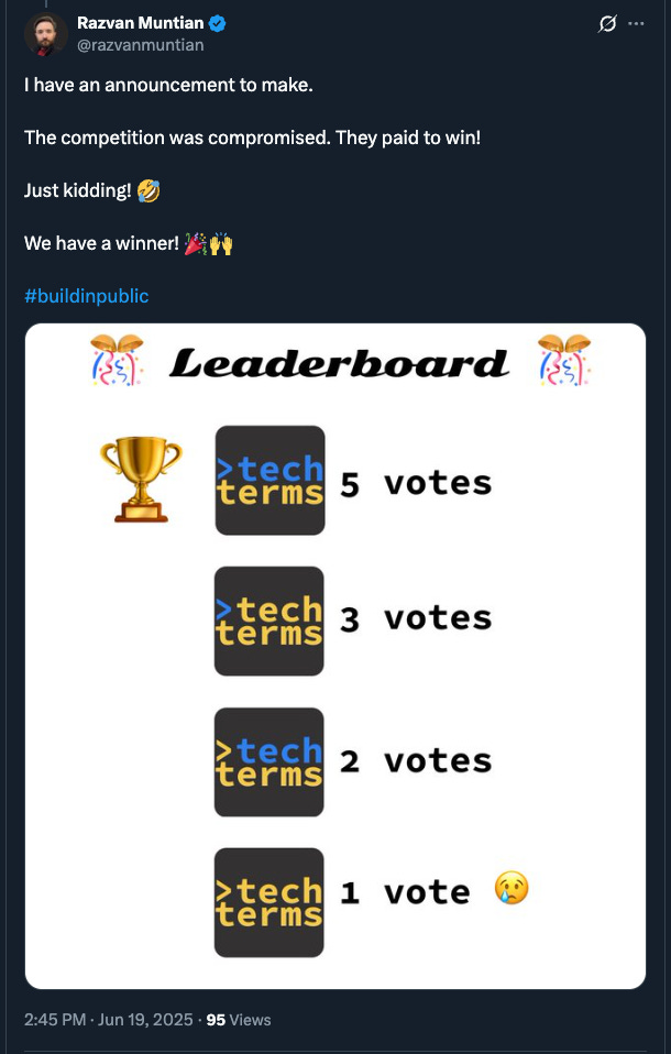
I've designed multiple versions of this logo and thought I could asked for feedback. I received some really good insights from the community, from Calvin and Guillaume. After counting all the votes on all the platforms, I think we have a winner:
Let's get some work done
In my previous build in public newsletter I gave you details about the layout that we want to use for the landing page. I created some basic wireframes. Based on those, I've started implementing the homepage.
There's not much to say at this point really. I'm trying to learn Astro and Tailwind while also making progress on the app. I'm using Cursor, so I can't say I'm trully learn Astro or Tailwind. On the other hand, Cursor speeds things up. It might not output the best code, but I'll be reimplementing that code in the future anyway.
From a project management standpoint, I don't think I've done a great job so far. I haven't properly split the big tasks or have a proper planning in place. At this point I think I should focus on getting an initial version out, then improve the Github issues descriptions for further tasks, setup proper release planning, priorities, and all that.
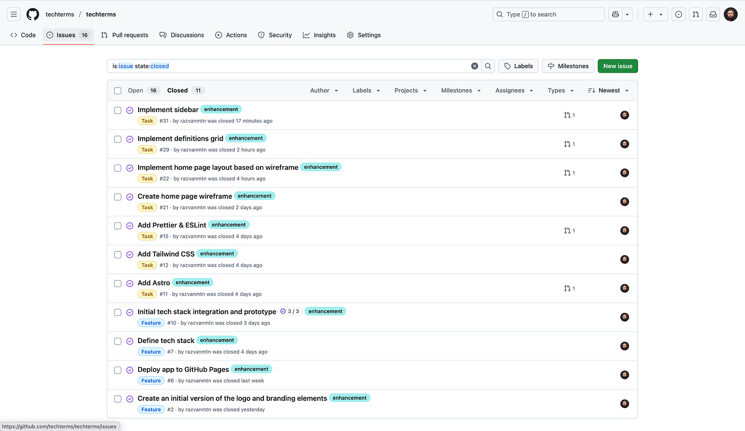
I snapped a screenshot of the latest issues I've closed. I'll keep working on the tasks while also learning how to better organize things and use my tech stack properly.
Coding in the sky ✈️
My last newsletter was about my 2-week trip to Porto🇵🇹. If you didn't have a chance to check it out, here it is: https://razvanmuntian.substack.com/p/lets-talk-about-porto
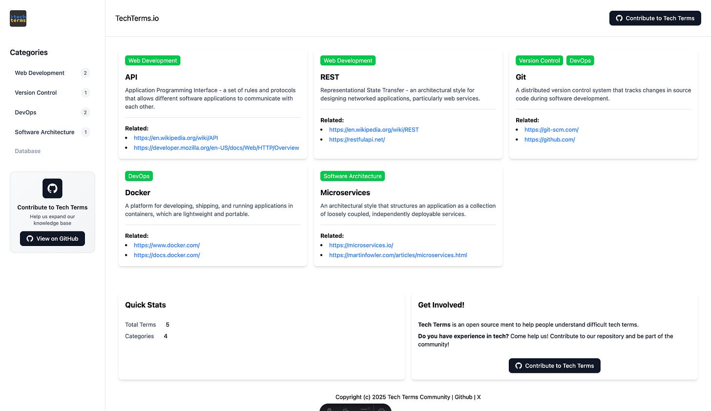
When we were flying back home, on my first flight, the one from Porto 🇵🇹 to Rome 🇮🇹 I managed to get some work done. Sometimes flights can be very distracting, but this time it went really well. Doing UI work without knowing all the Tailwind classes was a bit challenging. This is what I got so far:
Unfortunately I couldn't properly organize my work within multiple pull requests. I had no internet access, so I'll probably create a big commit and pull request when I arrive. Either way, I changed only some Astro components, so not much could go wrong.
I still need some planning for future tasks, since I want to involve others as soon as possible. Now that we have a layout, and some blocks in place, we can start adding some proper content to the website and promoting the product. That's my goal for the upcoming period.
In conclusion
There are still multiple newsletters to come on the TechTerms project, so stay tuned.
If you like what you've read, make sure to follow the progress on Github and social media. I'm sharing some links below that you can check out:
https://techterms.io - this is the app
https://github.com/techterms/techterms - you can find the source code here
https://github.com/techterms/techterms/blob/main/CONTRIBUTING.md - want to contribute code to TechTerms? start here
https://github.com/techterms/techterms/issues - found a bug or want to suggest a term? this is your link
https://x.com/razvanmuntian/status/1930203176466092409 - I'm regularly posting in this thread 🧵 about the progress I'm making
Looking for suggestions. If you think I can improve the newsletter in one way or another, feel free to get in touch.
Thank you for reading this post.
See you soon!


Naming, Logo and Colors are the hardest to decide because we do't really want to change those for a very long time